Styling machine schedules in LaTeX
Recently I worked on a project about the Job Shop Problem, and came across the need to visualize the machine schedules that were being generated. A quick search revealed the type of diagram I was looking for to be the Gantt chart. There’s a lot of tools that can produce these kinds of charts from data, like this python script in combination with gnuplot. However, I wasn’t looking to make a chart from data, and preferred to do it inside LaTeX, without embedding any images (to be fair, gnuplot is capable of outputting latex markup – but it seemed quicker to do myself).
Enter the pgfgantt package. There’s a wealth of information in the documentation, but some things aren’t immediately apparent. For example, machine schedules aren’t Gantt charts in the most usual sense, in which each row has exactly one bar. How do we fit multiple bars on the same row? I was looking to produce the following chart:
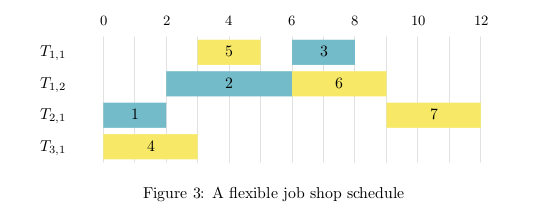
After some searching and tinkering, I came up with the following LaTeX markup below. It generated the image above.
\documentclass{article}

\usepackage{pgfgantt}
\definecolor{blue}{HTML}{74BBC9}
\definecolor{yellow}{HTML}{F7E967}

\begin{document}

\begin{figure}[h]
\centering
\begin{ganttchart}[
		x unit=0.7cm,
		y unit chart=0.7cm,
		canvas/.style={draw=none,fill=none}, % remove canvas borders, etc
		vgrid={*1{draw=black!12}},           % vertical gray lines every unit
		inline,                              % draw bars inline
		group/.style={draw=none,fill=none},  % remove group borders, etc
		bar top shift=0.1,                   % give bar 10% padding top/bottom
		bar height=0.8,                      % bar size 80% of vertical space
		y unit title=0.5cm,                  % crop titles a little smaller
		title/.style={draw=none,fill=none},  % remove title borders, etc
		include title in canvas=false        % no vertical grid in title
	]{-1}{12}

	\gantttitle{0}{2}
	\gantttitle{2}{2}
	\gantttitle{4}{2}
	\gantttitle{6}{2}
	\gantttitle{8}{2}
	\gantttitle{10}{2}
	\gantttitle{12}{2} \\

	\ganttgroup[inline=false]{$T_{1,1}$}{0}{1}
	\ganttbar[bar/.style={fill=yellow}]{5}{3}{4}
	\ganttbar[bar/.style={fill=blue}]{3}{6}{7} \\

	\ganttgroup[inline=false]{$T_{1,2}$}{0}{1}
	\ganttbar[bar/.style={fill=blue}]{2}{2}{5}
	\ganttbar[bar/.style={fill=yellow}]{6}{6}{8} \\

	\ganttgroup[inline=false]{$T_{2,1}$}{0}{1}
	\ganttbar[bar/.style={fill=blue}]{1}{0}{1}
	\ganttbar[bar/.style={fill=yellow}]{7}{9}{11} \\

	\ganttgroup[inline=false]{$T_{3,1}$}{0}{1}
	\ganttbar[bar/.style={fill=yellow}]{4}{0}{2}

\end{ganttchart}
\caption{A flexible job shop schedule}
\label{fig:schedule}
\end{figure}

\end{document}
So how does this work? I’ve defined the gantt group and gantt titles to have invisible backgrounds, to form the y-axis and x-axis coordinates respectively. The inline ensures that the gantt bars place their text inside the bar. The inline is removed for the gantt groups so that their values sit outside the chart. The rest of the parameters and style changes are fairly self-explanatory.
I started the chart at -1 in order to perfectly align the 2-wide gantt titles over the vertical grid. This means there is one unit of unused space on either side of the chart. It is a bit of a hack; I’m sure there’s better ways to do this. Ideally, I also would have liked to left-align the values inside the bars, but I wasn’t able to figure out how to do that properly. Perhaps next time.